4 Drawings Assessment
Animal texture
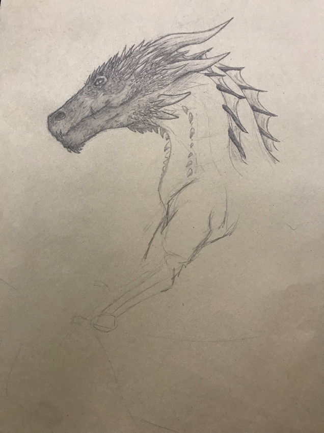
For this drawing I decided to draw Drogon from game of thrones, as the dragons in this show have many prominent details such as several horns and very large scales. As you can see from the unfinished body, i began by placing simple shapes and drawing the outline from there. Once the actual shape of the dragon is present, then i begin to fill in and add details.
For this drawing I decided to draw Drogon from game of thrones, as the dragons in this show have many prominent details such as several horns and very large scales. As you can see from the unfinished body, i began by placing simple shapes and drawing the outline from there. Once the actual shape of the dragon is present, then i begin to fill in and add details.
Tree
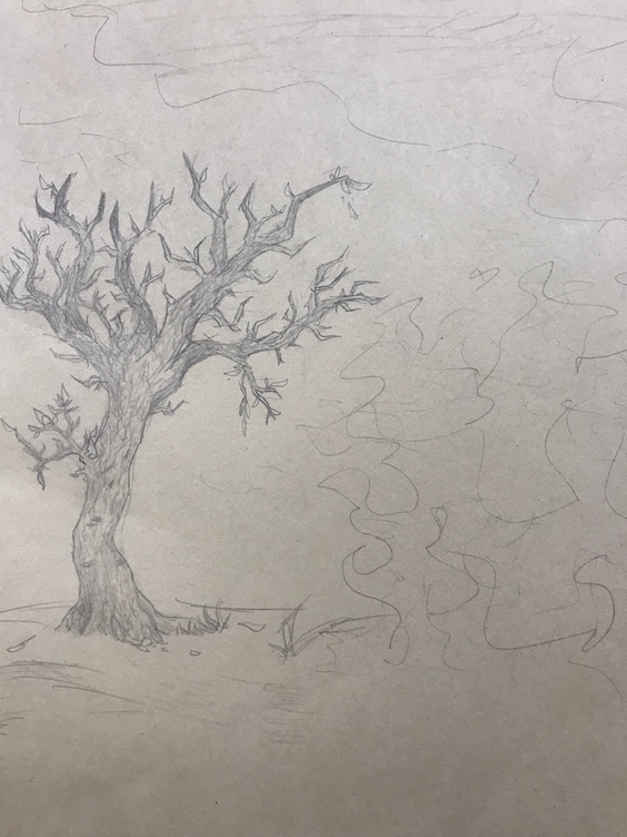
For the tree i completely forgot leaves exist. I drew a burnt tree. To make up for this and prevent my brain from melting, i including another drawing of a tree i did a few months ago for Sudkamp’s class. I draw trees by drawing jagged lines and then adding the shape of the trunk and branches from there.
For the tree i completely forgot leaves exist. I drew a burnt tree. To make up for this and prevent my brain from melting, i including another drawing of a tree i did a few months ago for Sudkamp’s class. I draw trees by drawing jagged lines and then adding the shape of the trunk and branches from there.
Two Point
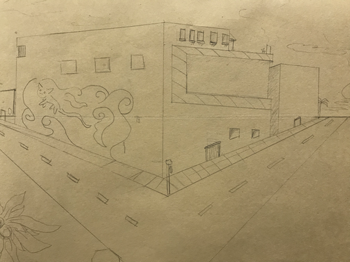
While my family is actually filled with architects, i despise building design and drawing buildings. I really kind of gave up with this, but i used a ruler to plot the points and sizes of the building.
While my family is actually filled with architects, i despise building design and drawing buildings. I really kind of gave up with this, but i used a ruler to plot the points and sizes of the building.
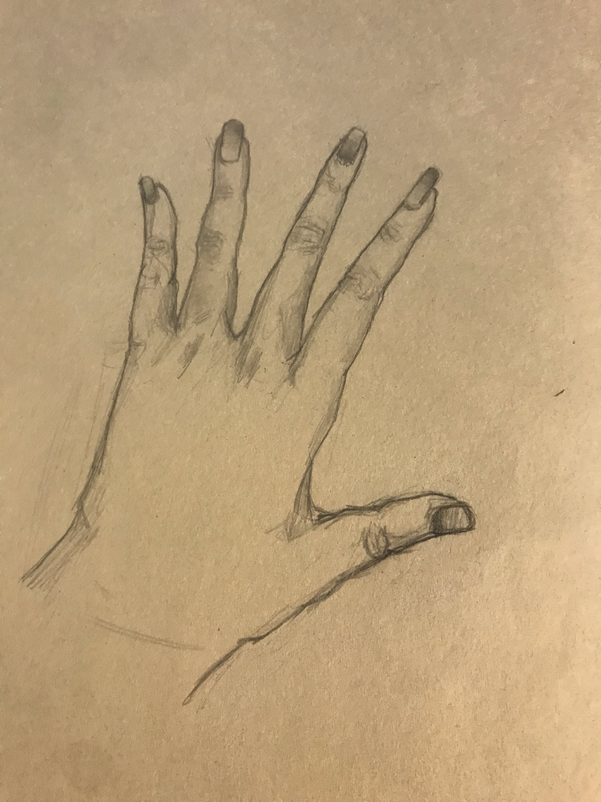
Hand
I like nail art so i didn’t exactly draw my hand, as i made the nails much longer than they actually are. I use the shape method with the hand as well, using a big square for the palm/center, and drawing lines where the fingers will be, and circles as the joints
I like nail art so i didn’t exactly draw my hand, as i made the nails much longer than they actually are. I use the shape method with the hand as well, using a big square for the palm/center, and drawing lines where the fingers will be, and circles as the joints
Contour Drawings
“Contour drawing, is an artistic technique used in the field of art in which the artist sketches the style of a subject by drawing lines that result in a drawing that is essentially an outline.“
We practiced blind contour first, where as could not view the drawing itself at all, and later practiced modified contours with the hand, shoe and backpack.
We practiced blind contour first, where as could not view the drawing itself at all, and later practiced modified contours with the hand, shoe and backpack.
Contour Room
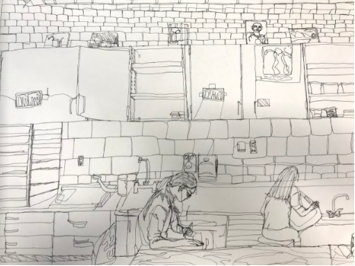
Anya
SELF EVALUATION
1. Did you use a fluid line? Explain how is this evident?
Yes I did. It is evident as you can see how certain objects like the posters on the cabinets, are actually connected to the rest of the cabinet through lines. This is done in order to keep everything one line, but still add those details.
2. Explain how your knowledge and creating practice studies with contour line contributed to the success of your piece.
Honestly for me I sadly didn’t really feel like it did. When we learned perspective in art i was out on vacation and i’ve always personally struggled with drawing rooms and symmetrical things.
3. Describe the difference in your contour line drawing to an outline drawing.
While a contour is still by definition an outline, you can also still add details such as wood grain and hair streaks. This addition makes it different from a pure outline.
4. Explain how your interpretation of line is essential in capturing the look of the room.
Well, seeing how i can’t draw a straight line to save my life, that shows that i actually feel that line is supposed to be fluid and curves. While not on purpose, i guess keeping everything a bit wonky makes it feel more playful and abstract.
6. What did you learn from completing this drawing? If you could recreate your piece what would you do differently to enhance the final outcome?
I learned i need to seriously practice drawing rooms because i hate it So much. I’d actually sit down and learn perspectives and practice contour more to maybe make the finished piece look nicer.
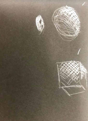
Value Charts
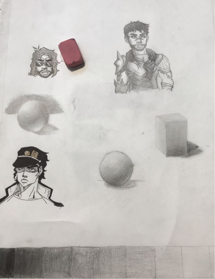
This is the first graphite value & shading work we did. Ignoring my other doodles on the paper, you can see my very first sphere practice, where i still use the fundamentals. However, my other sphere (middle left), was with the tutorial we followed and looks much better, as i don’t use lines it establish the shape and instead only use the shading. I also followed the shadows of the sphere itself, as we tend to forget that stuff isn’t completely flat.
Practice Still Life
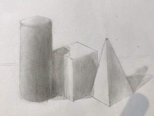
This was our first practice still life, where we set up several objects together to draw them & establish values, shading and also perception, with shapes overlapping eachother.
Black & White value chart and ribbon
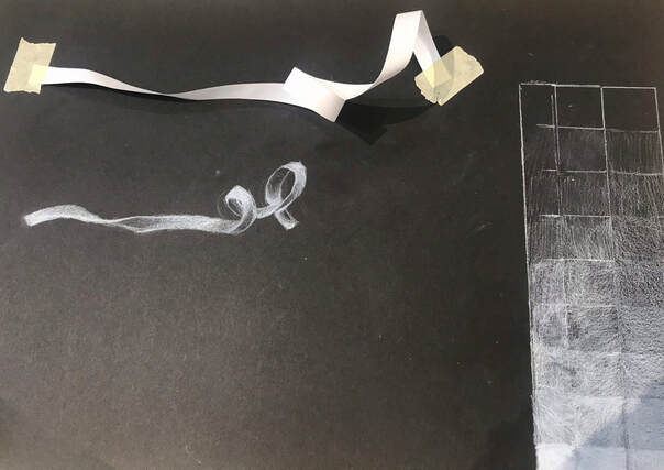
For this value chart, we used white charcoal, white prisma color, and one of those white charcoal sticks i don’t know the name of. The chart got smudged when i drew the ribbon. anyways, our white ribbon exercise was where we taped down a white ribbon with at least two loops and use a white medium of our choice, mine was prismacolor, and drew the highlights. We left shadows of the ribbon dark, since that’s the color of the pencil
Fabric
For this class activity, we studied and drew fabric on 3 different mediums from life. We learned how the shading works per each individual fold of the fabric.
Still Life
Final
Describe the craftsmanship of your drawing. (Is it clear, clean edges, blended well, smudges, defined space, etc.)
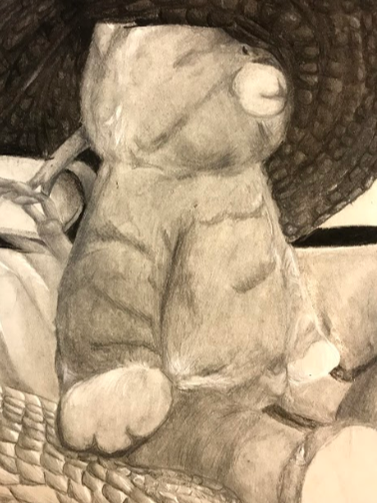
In general, I tried to remain clean, but towards the end smudges and brief spots of messiness became more prevalent. These spots were difficult to erase often, as it was a mixture of charcoal and graphite. In the end, I still feel that it's relatively neat.
Are your values and shadows realistic? How many values did you include? How and why are values important?
I believe they relatively are, as I tried to include several values. I cannot count them honestly, because of the amount of mediums I used as well. Despite the poor lighting in the picture itself, we can see that values are important because they help define depth and shape to a picture, for example, it puts the cat in front of the shoes, but the hat behind it.
Is there a clear source of lighting?
Yes, its too the center and above.
How important were the compositional sketches? Explain.
They were mildly important, as they helped you get an idea of what you were doing before you started.
How is your final drawing successful?
It establishes minimal texture within the fur and hat, and shows value.
Are the proportions, structure and perspective of the subject correct?
In relation to the reference, yes they are.
Does the placement & grouping of objects create a pleasing arrangement (composition)?
It's satisfying to see objects placed in a way that catches the eye. It establishes value and composition by filling up negative space, while still leaving some.
Is there a center of interest and is it well located?
I'd say the center of interest is the leftmost portion of the cat, as it contains the shoe, cat, hat, table, and scarf. It fills up the space, so yes.
How well did you manage your time and resources throughout the process of creating this drawing? Do you see where you could improve in this area?
My time spent on this project was a tad problematic, as i had traveled to tennessee in the middle of working on it, and while there i honestly barely touched it. I also spent way too much time on the cat, which left me scrambling to finish the surrounding areas of it.
What challenges did you encounter during this project and how did you overcome them?
The biggest challenge was the fact that I have an extremely strong hatred towards still lifes. The only way I could overcome this was to suck up my discomfort and just work on it, which is what I did.
What have you learned drawing a still life?
Placement of objects in a piece is very important, as if something is even slight off it can become a major distraction and make it very unsatisfying.
Perspective practices
We began to practice for our Look at this View piece by drawing all of the perspectives to practice. Using video tutorials, we followed along and did one point, two point, 3 point, worm eye and birds eye.
Prisma Color Practice
We practiced layering with prisma colors in order to be able to draw our fruits. With this practice, we also got familiar with how colors show on each paper type.
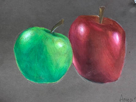
Prisma Color Fruit
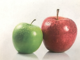
For this activity, we used prisma color to draw fruit. I chose the two apples, and found it actually a bit difficult to do the green apple. The green apple began having issues when it came to laying and keeping it smooth, with the paper starting to lift up, but the red apple remained relatively simple. The concept of laying the colors from lightest to darkest still applied here, and i used a blending pencil in areas looking a bit banded.
|
|
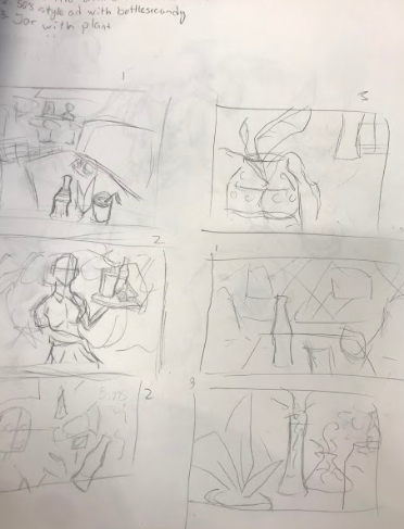
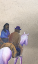
Look at That View pictures and composition sketches
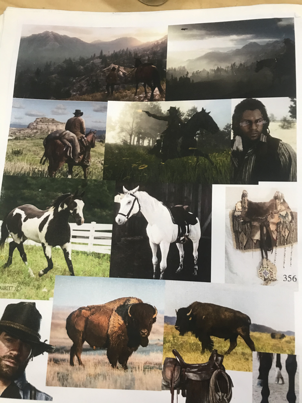

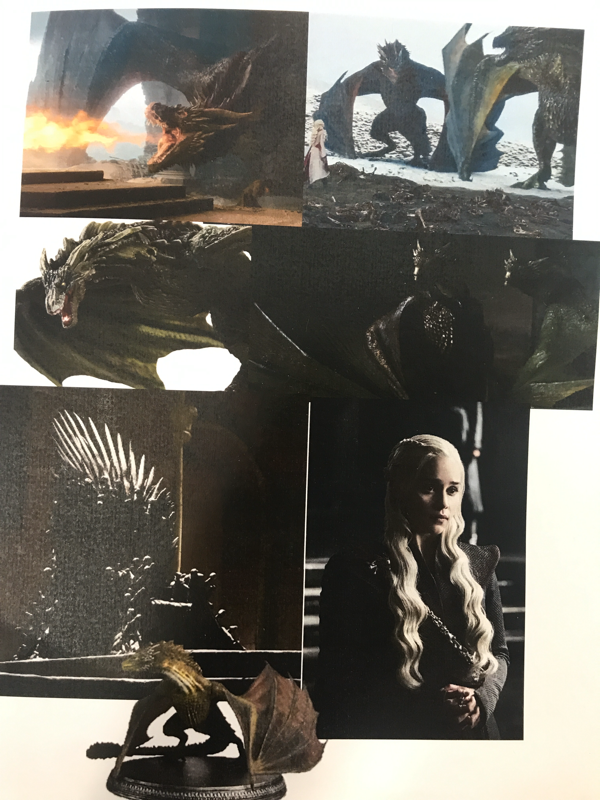

This section highlights the reference pictures and composition sketches for my two ideas, which were the cowboy landscape and daenerys targaryen with her three dragons. The main type of perspective i wanted to focus one was one point, as I personally found it to be the least confusing type of perspective to work with.
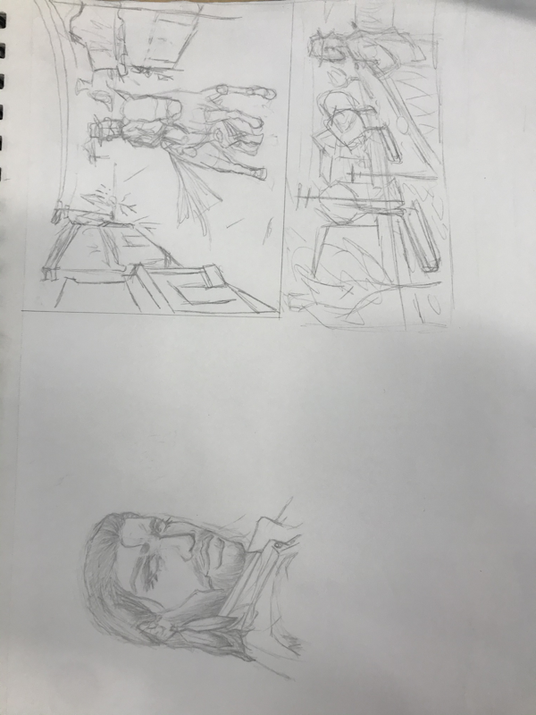
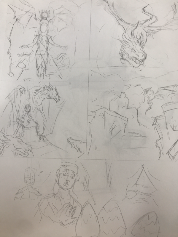
Look at that view project (In Progress)
* not even doing the pencil piece anymore. i can’t do it. i literally just cant! i have a concept i love and adore and i just physically cannot do it! I have never hated drawing so much in my life.
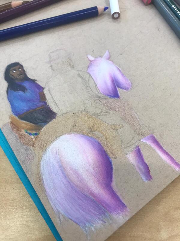

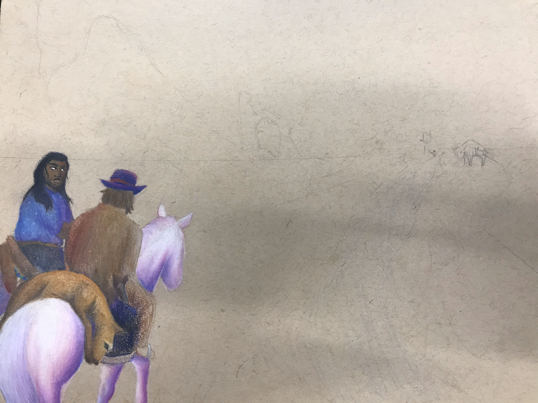
Describe how you created an interesting point of view? Was it successful? Why or why not?
While this is still in concept, I point the point of interest on the horizon where two bison were seen extremely small compared to the horses, even though they are massive in real life. I think its kind of successful, since it does establish perspective and size differences. Yet at the same time, my confidence for this entire thing is very lacking and it looks absolutely horrid to me.
Why is it important to understand perspective and how to draw it?
Perspective is great, because it helps define your art in a way that prevents it from being bland and flat. However, you need to know how to do it or else it can ruin the proportions and look of your drawing.
How were the colored pencil exercises important in the success of your piece?
They helped teach how to layer and efficiently bring out the color for the drawing, and how to blend it properly.
Describe the craftsmanship of your colored pencil. What techniques were used? (How well the project is technically crafted).
I got frustrated and didn't really use any craftsmanship, i just layered it very aggressively and when i got even more frustrated i proceeded to just add even more colors, which made it super messy. This also can be seen because i didnt listen to the fact that you're not allowed to use pure blacks and browns, and i ended up doing this, ruining it even more.
Were you able to achieve depth by showing a foreground, middle ground and back- ground? Explain.
No, even with the stuff i have done it just looks very flat and close up. If i continued it with colored pencil perhaps i could have, but for now it looks very very one dimensional
Explain your experience with colored pencil and the project in general. What were the obstacles and advantages?
My only experience with colored pencils is being a toddler and using coloring books, so the fact that i had to do an entire project with it was one huge obstacle. The advantage really is just the fact that you can show color, but the entire process of trying to do blending and details is one huge obstacle, especially if you have bad patience.
Looking back on the progression of this project what skills, techniques or other information would you like to have been taught? Do you feel you were prepared for this project?
I really wasn't prepared, i just learned perspective and just started with coloring, and the level of skill needed to pull this off was very high, which was horrible for me. I just wish i could be better at art, then I may have been able to finish it, but alas, my patience is horrible and i hate working with colored pencils so this was a disaster.
Chalk Pastel Eggs
for this class activity we just drew eggs
some eggs with pastels
yup.
used a picture we took of the eggs with dramatic lighting and just did the classic put random colors in thing.
some eggs with pastels
yup.
used a picture we took of the eggs with dramatic lighting and just did the classic put random colors in thing.
Transparent Candy
I wasn’t here in class really for when we did this and i just made this to try and catch up. You can see the amount of effort i put into this :)
Pastel candy (?)
This was where we took pictures of candy and tried to draw them, but i gave up again. I can’t do this anymore. like, does the amount of effort i put into this even matter? No!! because everyone in this class is better than me! i don’t even have the time or energy to try and make it good
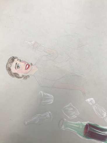
Opacity Final
|
|
Colored Pencil/ Pastel Opacity Project
Describe the craftsmanship of your drawing. (Is it neat and well executed?)
No. it's not well executed. It doesn't even resemble anything deserving of a partial glance. It's arguably one of the worst things i've ever made. I am so tired of drawing and this is a great example of how i no longer have any inspiration to do anything. It is horrible.
Describe how your background choices help unify the three artworks and tie them together as one piece of art.
They literally don't, because there is no background. I was originally planning on maybe making the background primary colors with classic ad fonts, but I didnt of course, because i can't. I cannot draw, and i especially cannot draw background. If you want to see a good background choice, go look at the ap art kid's works, because they're much better than anything i ever can do.
Describe your choice of colors/color harmonies and how you used them throughout the artwork.
There are no color harmonies. Great example would be whatever I was trying to do with the coke bottle, since it looks god awful finished. Highlights started out okay but i have no skill with colored pencil, so i cant do color harmonies or colors at all.
How did you create contrast in your drawing?
I mean with whats done i guess you can say highlight? Nothing else at all though.
How did you use textures, highlights and shadows to enhance your artwork?
The highlights that exist did not enhanced the artwork, and just made it worse.
Why did you choose a particular background color to mount your artwork?
Well its gray because i don't want to finish it.
Discuss the importance of understanding the media (prisma or pastels) and acquiring the skills necessary to create a successful project.
You have to understand the media, or else it will look awful. I dont understand the media, because we spend a whole day practicing it in class before we get thrown into a project, where its a choice between two medias you often just learned and aren't comfortable with. So of course it turned out awful, it reflects my skill in this class and subject
Describe any difficulties you had creating your drawing and what you could do to improve your drawing?
The entire project is a difficulty because trying to sit down and do something i hate and don't want to do makes me physically cry. I have an AP class, and yet this class is somehow the most emotionally difficult for me. I struggle to do anything with drawing. I cannot bring myself to even look at the paper with a project on it after i start, due to how much self loathing and hatred it brings. I could improve it by maybe being able to practice the subject matter more before, but that's a lost cause because i can't draw. no point anymore.
eyes and noses
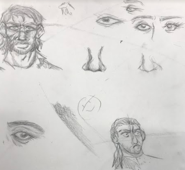
we drew realistic eyes and noses. which i don’t enjoy. personally decided not to make it bigger because it’s not like it’ll look better anyways, everyone around me has better ones so
mouth?
drew mouths i guess.
didnt do the hair thing but heres compensation with the times i drew hair decently
okay so i want to actually explain my hair method too. so what ill do to start off with is place a dot usually to the back top of the head, and use that dot to start out hair strokes and establish the flow. this dot can change due to hairstyles, but i draw a lot of undercuts/more on top hair so it usually stays there. with pulled back and pushed up hair i will usually put it at the very top of the hairline.
skull portrait
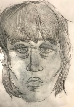
drew ourselves over a skull and it is ugly like me.
1. Explain the process you went through to develop your drawing.
|
Scratch board value practice |
Scratchboard final |
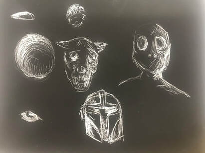
We used a mini scratchboard in order to practice using the tools and applying shading. Kind of did little horror bois because i think that works very well with black and white.
|
|
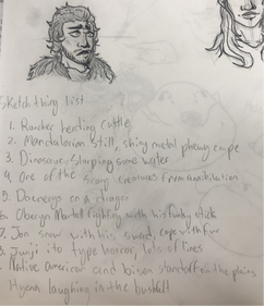
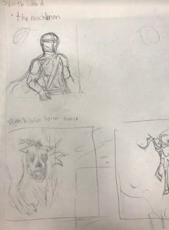
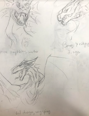
The ideas and composition sketches for the project
|
|
In progress pictures
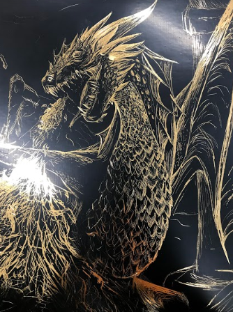
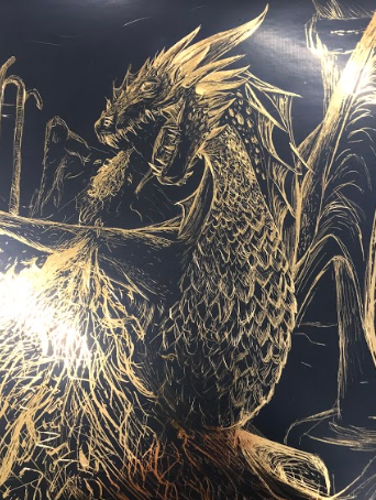
Final Scratchboard
|
|
1. Describe the subject matter and meaning of your artwork
Okay i just really like dragons and i thought it would be neat if i did Drogon again, since hes the first thing i drew for this year. There's not any deeper meaning to it. i just think dragons are funky. Also chose them due to the fact they're quite large, have a lot of textures to them and they also move around a lot.
2. How did you use textures to enhance your picture?
Using the scales and plates on the dragon helps define the creature's shape and body. Especially with this media, it assists in being able to define a source of lighting with highlights in order to establish contrast so everything doesn't blend together into one big ol' mess.
3. How did you balance your artwork and create a well-organized composition?
With scratchboard, you have to use a lot of contrast in order to show the different layers and areas of the piece. One place where i did this was with the dragon horns, as i had to make each horn have one bold line in order to show that there are several individual ones instead of just three big horns. I also added burned building to the background to show the size of the dragon in contrast.
4. How did you imply movement in your drawing?
With leathery texture of the wings and spines have stretch marks, since that actually occurs on animals like bats. It shows that this piece of skin actually moves and stretches instead of it just being flat and existing. I also do this with muscles in the wings and folds on the neck to show that the big boi is moving his body.
5. How could you improve your artwork?
Figure out how to draw fire on scratch board, because that was actually very difficult. I also panicked on the bottom where i wanted to show him curving his body, and i just did the outline of the leg and tail
6. How did you demonstrate a wide range of shading values?
By using different tools and pressure to apply different times of scratches in order to bring out the gold. I did this all along the body to show the 3d nature of the animal and it's textures.
